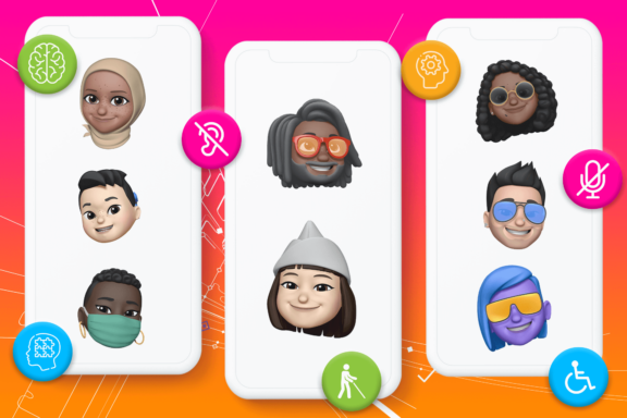
In the U.K., over 11 million people have a disability, impairment or limiting long term illness and about a third of this group experience difficulties pertaining to their impairment in accessing public, social, commercial and leisure goods and services (U.K. government).
In a digital context, disabled people are over 50% more likely to face barriers to accessing digital and online services than non-disabled people (The Big Hack).
Some of these difficulties, especially with digital products and services, are likely to be caused by inaccessible or exclusive design – which can be mitigated by designers adopting more accessible and inclusive design principles.
This article explores design processes/methodologies and the key differences between accessibility, usability, universal design and inclusive design as well as offering advice on how you can make your designs more inclusive.
Difference Between Accessibility and Usability
Accessibility and usability are closely related concepts that are often used interchangeably, this is incorrect as the two do have some distinct differences.
Accessibility is about addressing discriminatory aspects of the user experience for people with disabilities, making sure that they can view, understand, navigate, interact with and contribute to websites, apps, software and other digital products.
On the other hand, usability takes a more general approach and involves designing digital products to be effective, efficient and satisfying in a general sense – addressing issues that affect everyone, not just the issues that affect disabled people or other unique groups disproportionately.
Universal Design vs. Inclusive Design
Universal design and inclusive design are very similar concepts, though they do differ slightly they also overlap in a variety of ways.
Universal design is a design philosophy that’s based on seven universal design principles and aims to make digital products and services usable by the largest number of people, creating a single solution without the need for supplementary solutions to support users with differing needs.
The seven universal design principles that universal design is based on are:
- Equitable use
- Flexibility in use
- Simple and intuitive use
- Perceptible information
- Tolerance for error
- Low physical effort
- Size and space for approach and use
Historically, universal design has focused on architecture and industrial design but more recently it has been applied to both physical and digital products.
Inclusive design considers cultural, social and economic differences between users and addresses complex, intersectional disparities. It ensures that more target markets can be reached, allows digital products to be accessible to different markets and limits the risk of alienating potential users or markets.
Inclusive design rejects the idea of designing for the ‘typical’ user and aims to engage authentically with the diverse people audiences and target markets consist of – going beyond accessibility accommodations and individual edge cases.
Some areas that inclusive design addresses include:
- Accessibility for people with any kind of disability
- Access to and quality of hardware, software and Internet connectivity
- Computer literacy
- Financial situation
- Education
- Location
- Culture
- Age
- Language
Inclusive Design vs. Accessibility
Inclusive design is a methodological approach to design that focuses on ensuring a product, app software or website can be used effectively by a diverse group of people – including people with disabilities and people without disabilities
Inclusive design works on the basis that designs that are suitable for people with disabilities are likely to also be suitable for people in diverse circumstances, improving the experience of all users, not just people who may have trouble interacting with it as a result of disabilities.
This could mean ensuring that video or audio content on an app or website is accompanied by subtitles or a transcript so that the content is still able to be interacted with by someone with a hearing impairment as well as someone who might have forgotten their earphones at home and doesn’t want to play the content out loud in a public space.
An example of inclusive design outside of digital technologies could be a ramp outside of a supermarket, whilst it is a suitable solution for people who use wheelchairs it also helps some non-disabled people like parents with buggies, people who want to take their shopping to their car in trollies or those with temporary disabilities such as a sprained ankle.
The inclusive design methodology involves first identifying circumstances where disabled people are excluded then recognising that this exclusion is likely to apply to other diverse groups.
Accessibility can be described as a product of the methodological approach that inclusive design encompasses. Instead of ensuring every type of user can access and get the most out of websites, apps and software, accessibility is more focused on the improvement of disabled people’s experiences specifically.
Accessibility tends to be based on laws and guidance published by government bodies such as those published by the U.K. government’s Central Digital and Data Office or the Web Content Accessibility Guidelines (WCAG), rather than looking at lived experiences of exclusion as with inclusive design.
Whilst accessibility and inclusive design are slightly different and approach content creation in different ways, they are both vital to lowering barriers to ensure digital products can be accessed and used by a wide range of audiences – irrespective of their individual circumstances.
Another similarity between accessibility and inclusive design is that both recognise that disability exists where people are interacting with their environments.
How can you make your designs more accessible and inclusive?
Many take the view that inaccessible design is bad design. Here, we’ve explored some ways you can make your designs more accessible and inclusive.
Enrol in a Free Course
No one is expecting you to know everything from day one of your accessible design journey and it doesn’t have to cost you a lot of time or money to learn.
Consider enrolling in a free online course to brush up on existing skills or acquire new knowledge.
AccessibilityNet offers a free online Introduction to Digital Accessibility course designed for developers, testers, designers and more.
Conduct Exploratory Research
Exploratory research such as interviewing users can help you better understand and accommodate the needs, preferences and goals of a range of diverse people including those with different cognitive and physical abilities.
Google has published a Designer’s Guide to Accessibility Research which discusses research tactics to improve the way you design for all users and ability levels.
Study Context-Specific Technological Barriers
Look at the ways people have created fixes for the issues they’ve encountered when trying to access websites, apps, software and other digital products and strive to create better, more effective solutions.
For example, a user might utilise screen readers for text content because they aren’t able to read it. Designers could provide audio versions of all text content so that they no longer need to use third-party text-to-speech – which would simplify the user experience.
Consider Diversity at Each Design Stage
To create digital products and services that can be accessed and used effectively by users with a wide range of access needs, designers need to think about user diversity from the very beginning of any project, with user research through to QA and usability testing.
It’s much more time and resource-efficient to design inclusively from the beginning of a project than to have to go back and implement new solutions into an already existing or completed project.
Create an Inclusive Culture
Making inclusivity and accessibility a key focus of your company culture supports better design. You could do this by designating accessibility advocates to each team who are passionate about equal access or alternatively, you could create and share principles that encourage approaching projects with accessibility and inclusivity in mind with your team.
Microsoft has published a set of downloadable activity and support cards designed to help you and your team integrate inclusivity into your design process. Complete the activities to promote creative thinking and stress-test concepts from an inclusivity perspective.
Question All Design Decisions
Circumvent issues created by your own conscious or unconscious biases by asking the following questions after every design and development decision you make:
- Is that accessible?
- Is that inclusive?
- Is that ethical?
If the answer to any of these questions is no you should carry out further research to create a better solution.
Design with Accessibility Lenses
Typically when we talk about a lens in the non-literal sense, we are referring to a filter through which a topic or concept can be analysed and discussed separately to our everyday worldview.
To design with accessibility lenses means to approach design from the perspective of users (rather than that of a designer) so that you can better understand how different design choices affect users’ experiences.
Each lens presents questions to provoke thought on what problems users may encounter through certain design choices, however, it’s worth noting that accessible design should always be user tested rather than just considered theoretically.
Here are the 12 lenses of accessibility and their corresponding questions:
- Lens of animation and effects
- Are there any effects that could cause a seizure?
- Are there any animations or effects that could cause dizziness or vertigo due to the use of motion?
- Are there any animations that could be distracting as a result of constant movements, blinking or auto-updating?
- Can I provide controls or options to stop, pause, hide or change the frequency of animations and effects?
- Lens of audio and video
- Could the audio or video cause annoyance by automatically playing?
- Can I provide controls or options to stop, pause or hide any audio or video that auto-plays?
- Do videos have transcripts or subtitles?
- Lens of colour
- What meaning would be lost if the colour was removed from the design?
- How can I provide meaning without using colour?
- Are there any oversaturated or high contrast colours that could cause users to become overstimulated or uncomfortable?
- Do the foreground and background colour of all text, icons and focus indicators meet contrast ratio guidelines?
- Lens of controls
- Are all controls large enough for someone to touch?
- Are there any controls that are too close together and make it easy to press the wrong one?
- Are there any controls inside another control or clickable region?
- Is there a visible text label with all controls?
- Lens of font
- Can the font be modified to a comfortable reading level by the user?
- Is the font style easy to read?
- Lens of images and icons
- Is there any information that would be lost if the image was not viewable?
- How can I present this information in a non-visual way?
- For images controlled by the user, can I provide a way for them to enter an alt text description?
- Lens of keyboard
- What keyboard navigation order makes the most sense for the design?
- What can a keyboard user get to what they want in the quickest way possible?
- Is the focus indicator always visible and visibly distinguishable?
- Lens of layout
- Is the layout meaningful and logical?
- Does the layout do what it’s supposed to when viewed on a small screen or zoomed in to 400%
- Is content that is related or changes due to user interaction near one another?
- Lens of material honesty
- Is the design being honest with the user?
- Are there any elements within the design that behave, look or function as another element would?
- Are there any components that combine distinct behaviours into a single component and does this make the component materially dishonest?
- Lens of readability
- Is the language used plain and simple?
- Does the content in each paragraph focus on a single idea?
- Are there any long paragraphs or long blocks or unbroken text?
- Are all of the headings, links, controls and labels clear and descriptive?
- Lens of structure
- Can I roughly outline the HTML structure of my design?
- How can I structure the design to better help a screen reader understand or find the content they are looking for?
- How can I help the person who will be implementing the design to fully understand the intended structure?
- Lens of time
- Is it possible to provide controls to adjust or remove time limits?
Apple’s Best Practices for Inclusive Design
Apple outlines the following three pieces of advice for best practices for inclusive design:
- Design with accessibility in mind
- Support personalisation
- Audit and test your app for accessibility
You can find more in-depth information on a range of areas in Apple’s Human Interface Guidelines, such as:
- General accessibility
- Best practices
- User interaction
- Navigation
- Text size and weight
- Colour and contrast
- Appearance effects and motion
- Content
There are other ways that you can be inclusive as well according to Apple in their Inclusion Guidelines – which summarise that you should:
- Be inclusive by design
- Use welcoming language
- Be approachable
- Be aware of gender identity
- Represent a variety of people and settings
- Avoiding stereotypes and generalisations
- Support accessibility
- Support multiple languages
Google’s Accessibility Design Guidelines
Google’s UI guidance for accessibility is based on three core principles:
- Clear
- Robust
- Specific
The guidelines provide detailed information on the following areas, primarily for mobile UI design:
- Assistive technology
- Hierarchy
- Colour and contrast
- Layout and typography
- Writing
- Imagery
- Sound and motion
- Implementing accessibility
You can find more information on how to make your Android apps more accessible with this guide and the best approaches for testing the accessibility of Android apps with this document.
Microsoft’s Inclusive Design Principles
Microsoft’s inclusive design principles centre around these three areas:
- Recognise exclusion
- Solve for one, extend to many
- Learn from diversity
Microsoft’s inclusive design toolkit is available to download from its website.
Inclusive Design and Accessibility Guidelines
We’ve put together a list of some general guidelines, covering a variety of aspects, designers should adhere to when designing and developing digital products that can be used by everyone.
Text Content Guidelines
- Organise content in a logical order that makes sense for users who tab through content.
- Ensure headings stand out and that each section has its own heading.
- Ensure links make sense out of context and are front-loaded for screen readers.
- Make sure descriptions and the order that elements are read in with on-screen readers is coherent.
- Make all text a minimum of 16px font size to improve readability.
- Make sure text is resizable and is still readable when resized for those using non-default devices.
- When using small text, use uppercase, letter spacing and a heavier weight for improved readability.
- Limit line length to 50-60 characters on desktop or 30-40 on mobile devices for readability.
- Make line height/spacing at least 1.5.
- Use fonts with a large x-height.
- Avoid light text weights.
- Write inclusive, accessible copy that can be understood by everyone.
- Make PDFs accessible (check and verify accessibility with this Adobe tool)
Video and Image Guidelines
- Differentiate between informative and decorative images with ALT text. Provide useful ALT text for informative images that can be used with screen readers or provide null ALT text images that are purely decorative.
- Provide captions or descriptions for any graphics, data visualisations or time-based media for screen readers.
- Avoid embedding text within images so that meaning is not lost for people who are unable to view them.
- Limit image file sizes to less than 1MB so that load time is minimised and isn’t an issue for people with weak internet connections.
- Use images with pixel dimensions double the largest required view of the image for crisp resolution on larger than average screens.
- Avoid excessively animated or flashing content, including GIFs to avoid causing distractions or sensory overload.
- Provide transcripts and captions with all audio or video content.
- Use HTML5 video standards instead of Flash video – it’s faster and takes less time to render.
- Don’t preload videos on mobile devices as this can present issues for people with weak internet connections.
- Don’t auto-play audio or video content unless there is a very good reason for it to avoid overwhelming users.
Engineering and Markup Guidelines
- Use native elements.
- Use ALT attributes in all non-text elements.
- Validate markup for accessibility.
Keyboard Access Guidelines
- Add a ‘skip to main content’ link before the header for keyboard shortcut users.
- Carry out accessibility testing to ensure that all interactive elements can be reached and triggered with the spacebar, enter key or arrow keys.
- Make sure all interactive elements have a visible focus state (to show users which element has been selected and is ready to be interacted with) with intentional styles including focus, hover, active and visited.
Form Guidelines
- Make sure forms are single-column with descriptive labels.
- Avoid placeholder text within form fields, instead ensure it sits outside of form fields so it does not rely on users having to remember what the placeholder text said.
- Provide clear error states for incorrectly filled out forms so users know what to edit.
- Make sure labels are assigned to each form element for clarity.
- Avoid drop-down menus on mobile devices and use auto-complete with inline validation instead for improved usability.
Touch Target Guidelines
- Make touch targets a minimum of 44px.
- For apps and web design that will be accessed via mobile devices, ensure that all primary actions are doable with either left or right thumbs, make touch targets at least 48px and separated by 8px minimum for people who are using one hand.
Colour Contrast Guidelines
- Make sure there is sufficient contrast between colours.
- 4.5:1 for large text
- 7:1 for regular text
- Test if the contrast of your buttons complies with WCAG 2.1 with this button contrast checker tool.
- Avoid colour combinations that pose difficulties for people with colourblindness, such as:
- Green and orange
- Red and green
- Blue and purple
- Red and brown
- Blue and green
- You should also avoid functional colour combinations with no status descriptions, such as a green button for “go” and a red button for “stop”.
- Avoid or use sparingly colours that may be associated with sensory overload for people with Autistic Spectrum Disorders, including yellow.
Navigation and Interaction Guidelines
- Plan and design a clear, linear visual hierarchy.
- Avoid sacrificing functionality for simplification. Don’t hide helpful content i.e adding a question mark button that a user has to click rather than just presenting help information in the first place.
- Limit button and link text length for simplicity.
- Forgive user errors and facilitate corrections with specific guidance on where the user went wrong (for example, using the wrong email address to log into a platform).
- Improve your understanding of users with affordance and feedback.
- Design for the context the user will be in. For example, does an in-car navigation system require users to look away from the road to interact with it?
Scalability Guidelines
- Create responsive designs and consider all device form factors in overall plans.
- Make layouts zoomable and scalable.
Every UX/UI designer is responsible for seeking to create digital products that everyone can use, discarding their perceptions of how the ‘average’ user is interacting with said products and accepting that each individual is unique and will have differing needs.
This involves adopting a mindset that is committed to ensuring no one is excluded, from initial conception, research, prototyping, design and development.
Not only do we all have a moral responsibility to eradicate digital exclusion, but businesses that prioritise digital inclusion are also twice as likely to have higher shareholder returns, experience 28% higher revenue and see 30% better performance in economic profit margins according to research published by Accenture.
It’s also important to keep in mind that some of the most prevalent technological innovations have stemmed from the disability sector, including but not limited to email, typewriters, touch screens and voice user interfaces. Inclusive and accessible design pushes creativity and innovation.


